|
<< Click to Display Table of Contents >> Docking |
  
|
|
<< Click to Display Table of Contents >> Docking |
|
Panels can be dragged to new dock locations or set as a floating panel by dragging the panel by its title bar. When dragging a panel, a transparent docking widget will appear. to indicate possible docking locations in that area of the main window and will look something like the following image which varies depending on the docking area:
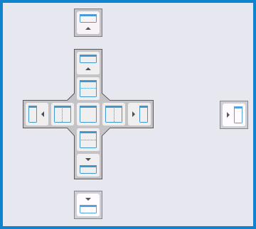
By dragging the mouse over one of the graphic symbols in the docking widget, it will cause the main panel to shade the part of the window where the panel will be docked should you drop the panel onto that particular graphic symbol.
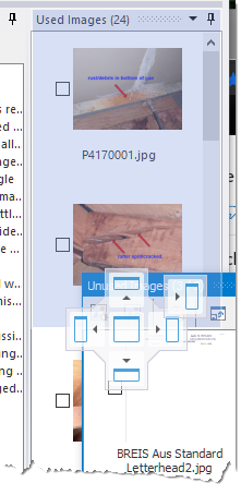
The first image to the right shows the Unused images panel being moved to dock along with the Used Images. By dropping it onto the upper graphic of the docking widget the Unused Images panel will take over the top position of the docking area currently fully occupied by the Used Images panel, which will be moved into the lower portion of the docking area.
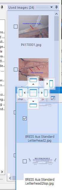
In the image to the far right, the same drag operation is being used, but instead of the top graphic of the docking widget it is being dropped onto the center graphic causing the two panels to merge into a single tabbed panel instead of one over the other. As you can see, the shaded overlay area shows a bottom tab to help indicate it will be a tabbed panel if that spot is chosen. |
|
|
At the top of every dockable panel is a heading bar that includes the panel's title and two buttons. The menu button  is equivalent to right clicking over the panel to bring up a related pop-up menu. The Pin button
  it a toggle button and will control whether the panel is pinned or not (if not pinned, it will be a tabbed pullout). A pinned panel will have this icon: and a tabbed pull out will have this icon:
  for the button. A floating panel will only have the menu button because there is nothing it can be pinned to until docked somewhere.
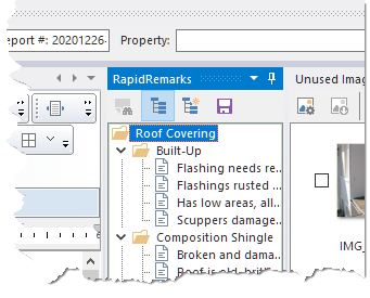
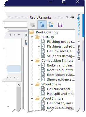
The first image to the right shows the RapidRemark panel pinned to its default location.
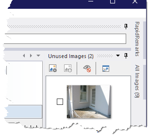
The far right image shows the RapidRemarks panel un-pinned (along with the All Images panel): |
|
|
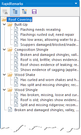
The first image to the right shows the RapidRemarks pulled out (either clicking the tab or simply hovering the mouse over the tab to get it to pull out).
The far right image show the RapidRemarks panel as a free floating panel. |
|
|
Docking will take some time to get used to, and it is suggested that you play around with it until you are comfortable using it. You can always reset the layout to the default "out-of-the-box" layout should things not go as planned. You can also save the layout as you progress so that you don't always have to start over when setting up various layouts.